ЁЁЁЁCSSвВГЦзїВуЕўбљЪНБэЃЌгУгкПижЦЭјвГФкШнЯдЪОЧщПіЃЌЫќПЩвдПижЦHTMLЮоЗЈПижЦЕФаэЖрЪєадЃЌРћгУCSSФмЪЕЯжЖржжЖрбљЕФЖЏЛаЇЙћЃЌжЎЧАЮвУЧЗжЯэЙ§КмЖрCSS3ЪЕЯжЕФЬиаЇЁЂЖЏЛМАвЛаЉгЮЯЗЃЌНёЬьдйРДНЬДѓМвбЇЯАШчКЮЪЙгУМђЕЅЕФCSSДДНЈВЛЭЌРраЭЕФЦНУцЭМаЮЁЃ
ЁЁЁЁЪЕР§ЗжЯэ
ЁЁЁЁОиаЮ

word-wrap: break-word; background-image: none !important; position: static !important; padding: 0px !important; line-height: 1.1em !important; outline-style: none !important; outline-width: 0px !important; width: auto !important; bottom: auto !important; float: none !important; height: auto !important; font-size: 10pt !important; vertical-align: baseline !important; top: auto !important; right: auto !important; left: auto !important;">1 |
.rectangle { |
4 | background-color: #6DC75F; |
ЁЁЁЁШ§НЧаЮ
2 | border-left: 75px solid
transparent; |
3 | border-right: 75px solid
transparent; |
4 | border-bottom: 150px solid
#6DC75F; |
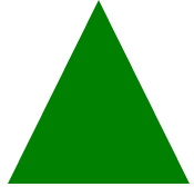
9 | <div class="triangleUp"> |
ЁЁЁЁЭждВаЮ

05 | -moz-border-radius: 150px / 75px; |
06 | -webkit-border-radius: 150px /
75px; |
07 | border-radius: 150px / 75px; |
ЁЁЁЁдТбРаЮ

5 | box-shadow: 15px 15px 0 0 GREEN; |
ЁЁЁЁЪївЖ

2 | border-radius: 5px 300px 3px 300px; |
дФЖСШЋЮФ
ЩЈТыЙизЂЁА ЖрЬизЪдДПт ЁБ